

Mobile app design
Creating Google Hire’s mobile app
Background
Recruiting is a job that never really stops. From the beginning, our team saw a big opportunity to help recruiters be more productive on the go, yet a competitive analysis showed that there was no ATS on the market with a well reviewed app.
I took on the role as lead designer for Hire’s mobile app from to initial conception and research through through the initial beta launch. I led design for about 1.5 years on this team, this is a small sampling of the work from that time.
As design lead on a newly formed team, I was also responsible for creating the team’s processes that would allow me to work effectively with product, engineering, and QA partners. You can read more about my work leading the team, creating our processes, and creating a user centered culture here.
Approach
1. Research & strategy
Identify opportunities to make recruiter’s lives easier using their mobile device and distill into an actionable strategy
2. Design
Create a basic app architecture that supports the product strategy and collaboratively design and launch features.
3. Feedback and iteration
Constantly measure, conduct research, and iterate based on what you learn
Research & strategy
Understanding the problem
When we first kicked off the project, the strategy and direction for the mobile app was largely undefined. We knew a lot about recruiters and their overall needs, but we didn’t know much about how they worked, or wanted to work, on their mobile devices.
I developed a card sorting exercise to dig into the specifics of recruiter’s needs on mobile to help bring clarity to our strategy. We asked recruiters to sort a long list of their most common tasks into the following three categories, and asked them to stack rank the tasks in each category by importance.
I currently do this on my mobile device
I want to do this on my mobile device
I have no interest in doing this on my mobile device
Afterwards, we aggregated the results to get a sense of the biggest opportunities we saw to make recruiter’s lives easier using their mobile devices.
This research quickly revealed to us that recruiters don’t want to do everything on mobile.
There are very specific use cases that are critical for a recruiter when they’re on the go.
We analyzed what kinds of use cases recruiter’s cited as being most exciting to do on their mobile devices, combined it with what we generally know about user behavior, and formed our mobile strategy around what we learned.

Example card sorting exercise
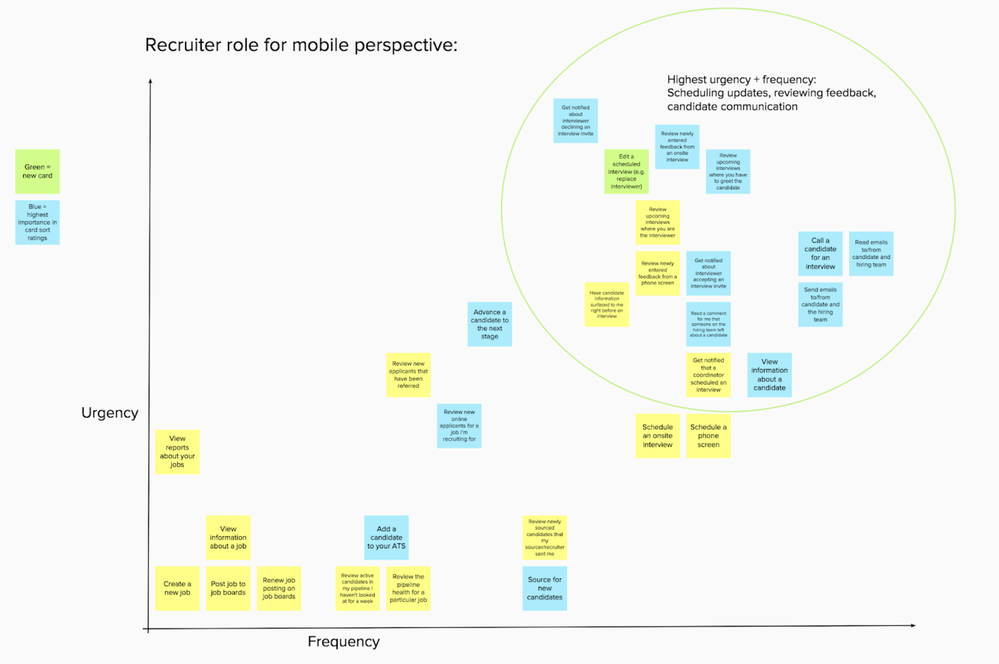
Aggregated analysis of tasks in the category “I want to do this on mobile.” on a grid of urgency and frequency to help us prioritize.
Developing a strategy
Most importantly, we decided to pursue select high impact mobile experiences rather than trying to build a full feature parity mobile app. With regards to the use cases, we noticed they typically fell into three categories (listed below), and generally were cited as ways to ensure the hiring process was moving fast and efficiently.
From this, we formulated a mission statement with three pillars to guide feature development.
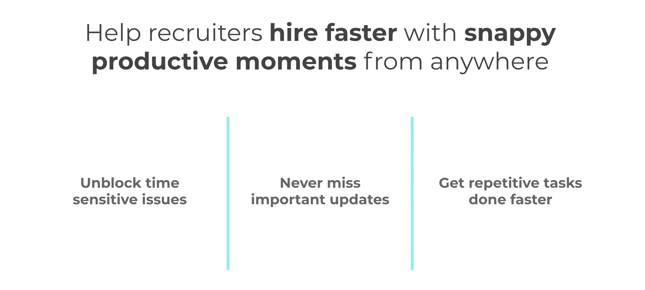
This missions statement informed not only what features we chose to prioritize, but also how we designed those features. As shown in the examples below, we pushed hard to reduce the amount of steps in user journeys while continuing to give recruiters the flexibility and control they needed.
Prioritizing an initial scope
Using the framework above, we prioritized an initial scope with a balance of table stakes required for an MVP app, as well as a few select differentiators we felt would really help move the needle on recruiter mobile productivity.
We identified the differentiators below by looking at the intersection between recruiters top needs in each of these categories and experiences where we felt we could deliver experiences that were lightweight and felt ‘snappy’, while still giving recruiters the control they needed.
Unblocking time sensitive issues from anywhere
I want to be able to quickly replace a last minute interviewer who’s declined
I want to quickly send templated emails to candidates
Never missing something important
I want to get notified when new interview feedback has come in
I want to be able to review a candidate’s resume before an interview
Getting repetitive tasks done faster and smarter
I want to be able to quickly review new applications in spare moments
I want to be able to send a note about a candidate and tag a team member
I want to be able to quickly call a candidate (this sounds so basic, but recruiters we talked to literally had either thousands of contacts in their phones, or complaints about how much of a pain it was to look up a phone number on their desktop)
Design
Creating snappy productive moments
When we first started the design process, we spent a lot of time thinking about how ‘snappy productive moments’ translate into design principles. We landed on three things:
Reduce time to select a task by surfacing the most important things
Reduce time to get to a task by creating shortcuts that help users take actions without navigating
Reduce time to complete a task by removing, suggesting, and automating elements while still maintaining control and flexibility.
As you’ll see below, these design principles guided our decision making as we created the app.
Defining a scalable architecture
Everything in the app was oriented around helping recruiters get tasks done. The architecture I created reflected this, with the first layer presenting different lenses through which recruiters could view their tasks and various mechanisms for delivering different types of updates to allow for scalability and flexibility when adding new features.

Updates page: A mobile command center for critical recruiting tasks
One key design area of the app was the Update page. This was the central area where we could help surface the most important tasks and updates to recruiters. Before we started design, we identified what key goals and metrics we’d want to look at in order to define success. Since the app was oriented around getting stuff done, our key metric was centered around driving action. Not all updates required action in the app though, such as reviewing onsite interview feedback, so we also wanted to capture general engagement and views of different update types. Last, we wanted to measure overall satisfaction and feelings toward the app, which we did through qualitative feedback such as a diary study with our beta testers and interviews.
Metrics
For each type of action: # of actions taken / user / time
For each update type: # of engagements with updates / user / time (we never were able to implement this due to eng cost)
Use qualitative feedback to inform feeling of speed and usefulness
In the final version of the page, we broke it up into three sections aimed at providing the most important and useful information, cascading from an upcoming interview to tasks and updates down to recent candidates and jobs to help minimize the need for navigation.

Taking action without navigating: Initiating a phone call
We always pushed to bring actions up to the highest level in the navigation possible to help the experience feel fast and assistive. A good example of this is contextually surfacing the call button for phone screens when they’re coming up. Recruiters could initiate a call with a candidate in one tap.
This seems small, but is a significant improvement from needing to open your web app, navigate to the candidate, find their phone, and manually type it in.

Initiating a call with a candidate
Explorations and user testing
Backing up, we did a wide variety of exploration and testing to reach the design shown above. Below are some earlier explorations we did of this page when we were looking at different structures for the page.
Note on design languages: These designs are in a different, older visual language than above. Because Google Hire originated as a startup called bebop and was acquired, it had a hybrid design language between material design and its original design language, as well as its own tech stack separate from other Google products. This was the language we originally launched with, but created a number of constraints in terms of the components and styles we could use in our designs. When Google Material came out, we began a conversion process to translate our app into Google Material and redesigned much of the app, however I left the team before this was completed.

Left: Tiles were a little more visually appealing and provided larger touch points, but weren’t as scalable and we knew we’d want to introduce new types of content over time.
Middle: Recruiters like high information density, so we experimented with a model bringing more content and information up to this top level. When tested, however, it was too much. Recruiters cited the need for a quick overview of task type and choosing where to dive in before seeing the details.
Right: This is what we launched our initial trusted tester with. I’ll discuss the feedback we received on it below, but overall it provided a solid, scalable framework allowing recruiters a clear overview of their tasks.
Overall, users responded very positively to the design we originally launched with, often asking if we could update the desktop version to be more like this one. There were of course opportunities for improvement as well. In addition to a visual refresh, we made some additional changes based off the feedback we heard in our initial Trusted Tester and Beta launches. These changes ranged from fixing usability problems such as removing the expanding/collapsing cards to adding new functionality that helped increase speed and reduce need for navigation.

Making changes to the design based on user feedback in our initial launch.
New application review
Once a recruiter used the updates page to select a task, we pushed hard to make each of those tasks feel fast, efficient, and productive. New application review is a good example of this.
Recruiters often receive hundreds of new applications they need to evaluate on a tight timeframe. Before mobile, they needed to set aside large amounts of time during their day to get this done at their computer. Our goal was to break this task down into bite-sized chunks that could be done on a commute or between meetings.
We had a regular user research program for the mobile team and conducted user research sessions pretty frequently. From this research, we learned a few key insights about recruiter’s needs for reviewing applications:
Traditionally a desktop only activity, but strongly desired on mobile
Speed is critical, but so is a high level of control
Recruiters must take follow up actions, not just advance or reject.
Scanning and clear information hierarchy is critical.
““A lot of applications come in when I’m not at my computer, [...] being able to stay on top of them rather than going through them all in the morning would be ideal.””
We wanted the experience to feel lightweight and fast, almost like swiping through a dating app, but without trivializing the importance of a job application and by providing ample control. Before I dive into the design process, here’s a preview of what the final design looked like with some design considerations called out.

It took several rounds of exploration, feedback, and iteration to get to this. When designing anything, I value rapid iteration in the lowest possible fidelity to quickly explore a broad set of ideas and solicit rapid feedback. Below are some verrrry early sketches I did just mapping out the key steps of the review workflow for recruiters, from initially being notified about new applications to seeing a summary of the work completed.

Next, we explored a wide array of options across the key decision points of the user journey. Some of the key nodes of exploration included entry points into the flow, layout and optimization of the review screen (shown below), and the UX for showing a summary view.
Here are three different version we explore for the layout of the review screen in medium fidelity. We wanted the experience to feel lightweight, almost like swiping through a dating app, but without trivializing the importance of a job application. We explored options for button placement, button design, and information hierarchy. We intentionally did the screens in greyscale to help make them seem more unfinished to encourage feedback from different stakeholders.

From left to right: Our designs evolved to optimize for button placement over time. We moved the core decision buttons closer to the thumbs, and moved from a dropdown to a single tap ‘Advance’ button (while keeping the ability to edit afterwards) to help it feel faster.
We build a small interactive prototype and conducted usability testing with users to get early stage feedback. Below are some of the changes we made between what you see on the right above and the final design, ranging from small usability fixes to adding additional features that we expanded scope to include after hearing how critical they were for recruiters.

Below is a short gif of the experience that can give you a sense of how it feels to tap through candidates.

To bring the experience together into a full user journey, below is a video showing the journey from the recruiter selecting the task on Updates through completing it.
Scenario: Kathy, a recruiter, is on the bus to work, and wants to check up on her open position for Software Engineer to see if there have been any new applications.

A detailed view of the redlines I created for an earlier version of the design
Working with engineers to launch the feature
After completing design. I worked closely with the engineering team to build and launch it.
I document design differently depending on the developer’s working style and the amount of existing documentation. Because we worked mostly remotely, didn’t have a strong style guide yet, and the developers hadn’t done much UI development, I did fairly extensive documentation and spec’ing to ensure accuracy.
Over time I pushed the dev team to componentize and refactor certain elements to reduce the amount of necessary documentation to help us save time. To the right you can see a detailed artboard of my spec. Below is a zoomed out shot of the full set of artboards I delivered to go along with their corresponding stories on our Kanban board.
Recruiters liked the mobile app!
Overall, feedback about the app has been very positive. Below, you can see the synthesized results of our follow up research session after launching the app. Our core value proposition of ‘snappy productive moments’ was noticed and appreciated by users, and most participants cited many of our top differentiators unprompted.
“I would like to say whoever created the Google Hire mobile app is a lifesaver. Thank you.”

Continuing iteration
Just a quick note that product iteration doesn’t end! After our initial launch, we were already building our next set of features and iteratively launching and testing them in the same manner as described above.
Please feel free to reach out if you have any questions!