
Information architecture
Leading a navigational architecture redesign for Google Hire

Background
In 2017 Hire was receiving significant user complaints that the app was difficult to navigate. Our biannual Happiness Tracking Survey (HaTS) showed significantly lower scores from recruiters, with clunky navigation and ‘too many clicks’ being cited as one of the main points of dissatisfaction.
This project was launched on a tight timeframe to understand why our current system wasn’t working for recruiters and to fix the problem. I co-led design for it with another designer on my team.
We were able to solve the problem by creating a new, scalable navigation structure that more accurately reflected the mental model of the users. When launched, we saw a 15% increase in our recruiter HaTS score, and navigation went from being a detractor to customer satisfaction to being cited as one of the things they loved most about Hire.
Approach
We approached the project in three phases.
1. Define the problem
Identify whats not working for our users and create design principles that ensure we address the fundamental issue. Luckily, from previous research we had most of the information on hand as to what wasn’t working.
2. Solve critical use cases first
Start with design of top critical use cases and ensure their behavior matches user expectations. Our system was complex enough that trying to think about everything at once quickly overwhelmed the team. By focusing in on the design of a few key use cases, we temporarily simplified the problem and ensured those cases were fully address before expanding back out to address all possible use cases.
3. Create a scalable system
Build a simple, predictable, and scalable system that can handle all the edge cases and complexity in our app.
Defining the problem
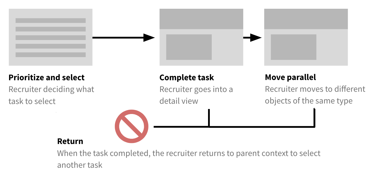
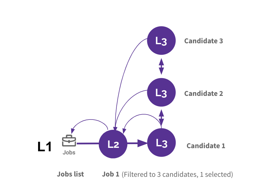
From research and deeper investigation into the HaTS results, we learned recruiters want to work in a pattern of repeated task completion. You can see the steps in this process illustrated below. Critically, this model requires being able to return to the context from which you came in the same state that you left it in order to select your next task (and not get lost).

Recruiters work in a pattern of repeated task completion, but Hire didn’t support this kind of navigation.
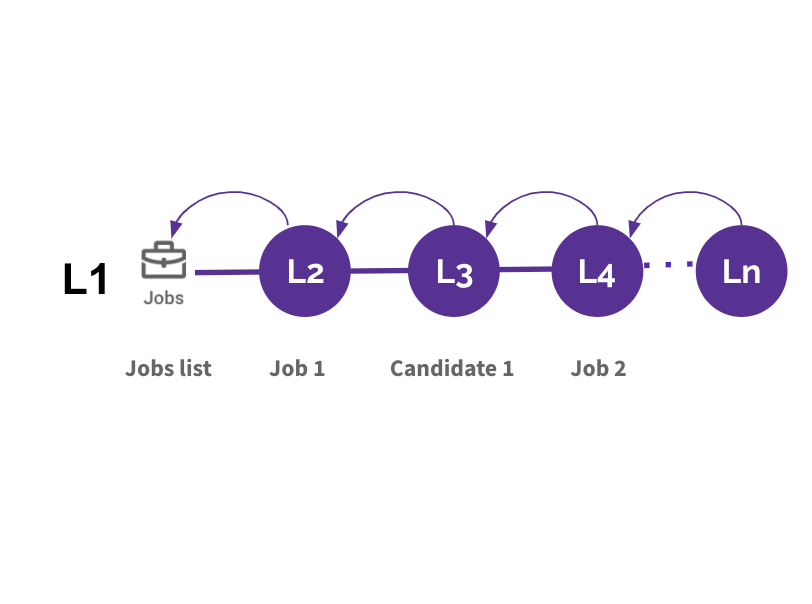
Instead, it used a strict hierarchy where ‘back’ would always take you back to the area that object lived in, rather than where you came from. For example:
Example: As a recruiter who navigates to a job and then views a candidate applying to that job, the recruiter would not be able to directly return to the job. Instead, they’d be taken back to a candidate list, because that’s where the candidate objects belonged according to the implementational model.
This implementation caused significant confusion and frustration among our users. They’d constantly lose their context and become lost, being taken out of their flow and losing time.
The problematic implementation of our navigation system didn’t allow users to return to the context where they’d started a task.
Addressing the fundamental issue
The desired behavior in the previously described use case was pretty clear, but coming up with a scalable pattern across the app was more contentious. There was significant pressure just to quick-fix the most problematic area and move on without solving the fundamental problem or providing guidelines for future implementation.
While this would have fixed the immediate problem, I saw major risks with not providing stronger guidance for our overall navigational system. Specifically, I was nervous that our navigation architecture would be inconsistent in different areas of the app, further confusing users, causing more frustration, and requiring more resource investment in the future.
I convinced the team to extend the project and invest more in the short term to ensure we created a systematic, user centered navigation system to make our users happier and save development and design costs in the future.
Design principles
Before beginning design, we encapsulated our definition of the problem in a set of design principles created to help guide decision making and conversations as we explored different options.
Path focused: Architecture should be oriented around the most common paths users take through the app. Users need to be able to easily return to where they came from, with the state (filters, selection, etc) preserved.
Predictable and consistent: The user should never be surprised by where the navigation in the app leads them.
Scalable: Our solution should be defined by rules that other teams can continue to apply to new features in the future.
Solving the critical use cases
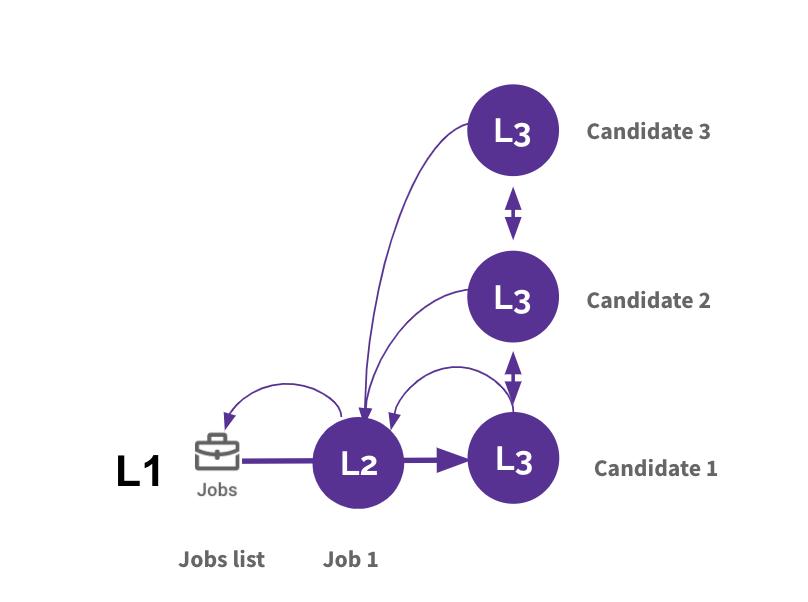
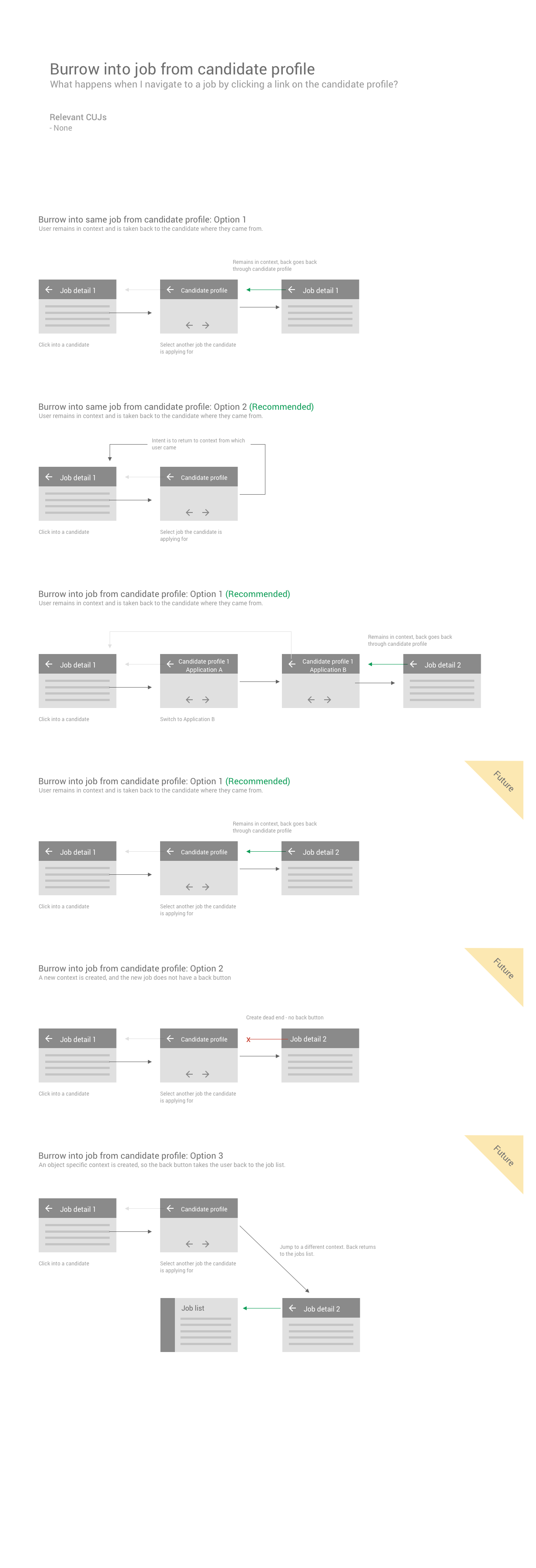
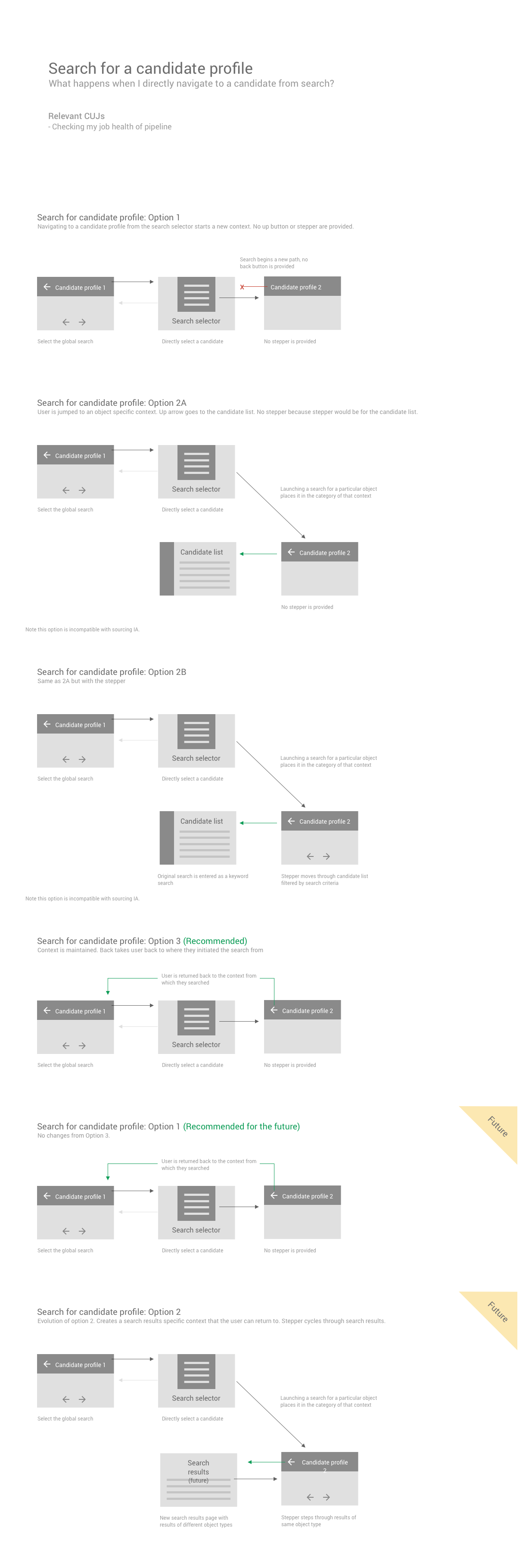
There were a couple of key use cases that were causing the most suffering to our users, but far and away the one that received the most complaints was the following. task. Recruiters are reviewing new applications constantly, and as you can see below, our navigation system was making it very difficult.

We applied our knowledge of how recruiters work and used our design principles as guidance to make the following recommended changes. These changes brought our system much more in line with recruiter’s mental model of how they expected it to work, making it easy to move in and out of tasks, dip into jobs or candidates and quickly return to move onto the next thing. After some light user testing and review with our senior leadership, the approach was approved.

These changes introduced several new paradigms such as back navigation based on the ‘pathway’ rather than the object and lateral navigation between objects within lists that formed the foundation of our navigation system.
Creating a scalable system
We took the core design attributes of our solution to the critical use cases and worked with engineering to create generalizable rules out of it. These rules held consistently across the app and were applied consistently to new projects.
This navigation system became known as ‘Pathways navigation’ because it flexibly optimized for whatever pathways recruiters preferred during their workflows.
Handling edge cases
By the time this project started, however, our app was already very complex. At this point, as illustrated above, we knew the core principles of our system. In reality, however, there were a wide variety of edge cases and odd use cases that made doing this in a consistent way deceptively complex.
To make sure everyone was aligned, I detailed out 30+ different navigation use cases in the new model to illustrate the desired behavior and facilitated conversations around all possible edge cases to ensure we had a consistent system. These use cases ranged from the core, ‘happy path’ navigational use cases to somewhat strange edge cases our system needed to support to maintain its flexibility. With help from the engineering team, we distilled the desired behavior into a clear and consistent set of programmatic rules.
Below you can see all the different use cases I drew out (click on each one to get a closer view).


From a liability to a differentiator
In our next Happiness Tracking Survey (HaTS) following the launch of this new navigation system, scores from recruiters jumped by +15%, the biggest movement we’d seen ever, and complaints about navigational clunkiness largely disappeared.
Even more excitingly, as you can see below, 45% of respondents cited ‘Ease of use’, with navigation and workflows being what they liked most about Hire.
