Design leadership

Improving member satisfaction with a cross functional UX strategy
Background
In April of 2022, I joined Garner Health as their Head of Design and first full time designer with the charge to build a high performing design team to create a usable, understandable, and trustworthy member experience.
I joined Garner at a really exciting time. The company was starting to get real traction in the market, signing larger clients, and growing rapidly. When I joined, member experience wasn’t at the forefront of the conversation. Stakeholders conceptually knew that have a good member experience was important, but there was no clear grasp of how members currently felt about the experience, if it was an issue, or what the business impact of that could be. Without that understanding, there wasn’t much appetite to invest in improving the member experience.
I set out on a mission to figure out what members really thought about Garner, understand how it was impacting the business, and make a case that investing in improving it would have a high ROI.
Approach
1. Evaluating the current experience
2. Building the business case
3. Defining an experience strategy
4. Enabling a UX culture
5. Measuring impact
Evaluating the current experience
When I joined, the company had very little understanding of our members, what they thought about Garner, or how that was impacting the business. I immediately set out to change this by conducting research interviews, building and running an NPS survey, and reviewing both client and member feedback our Account Management and Concierge teams had received. Together, these different sources built a relatively clear and consistent picture of what our members were saying about Garner.
Unfortunately, it wasn’t a pretty picture.
While many members had a great experience with Garner, many felt extremely frustrated by it, citing slow, opaque claims processes, not enough doctors, and confusion with how the program worked. In the initial surveys, our NPS score hovered around 0, meaning about there were roughly an equal number of people giving us a 9 or 10 as there were giving us a 0 - 6. Additionally, as you can see in the charts below, almost 15% of members gave us a 0.

Our NPS data from our initial surveys. NPS was 1 (On a scale of -100 to 100). This is generally seen as a poor score, and is below industry average even for insurance companies.

The data showed three clear themes: Provider access / coverage, claims, and usability.
We also collected a large amount of qualitative feedback - both from the surveys as well as from a series of interviews we conducted to dig deeper into member issues. This feedback helped us understand more nuance to the issues members were facing, as well as helped make their issues more concrete and motivating to the team. This quote particularly stood out to me as representative of a much broader theme we heard about:
“I am struggling to navigate it. I don’t have a lot of time to spend on it and it’s hard to figure out. I might love it, if I could figure it out.”
- NPS respondent
Putting it all together, three clear themes emerged:
Members had trouble finding providers that fit their needs.
We received consistent feedback that we offered too few options for doctors, and the options we did offer weren’t taking new patients or were too far away.
Members were frustrated by a slow and opaque claims process
Members felt like it took too long to reimburse claims, and were frustrated at how little visibility we gave into the process. Additionally, they felt like our claims policies were overly restrictive and that they had to jump through too many hoops to get reimbursed.
Members didn’t understand how Garner works
Members were generally just confused by Garner. They didn’t understand how it was related to their insurance or how to use it properly in order to get reimbursed. This lack of understanding exacerbated the issue with claims, as members would frequently not qualify for reimbursement because they lacked the understanding of how to correctly qualify.

A summary of client feedback created by our AM team. The results reaffirmed our assessment from our research with members.
6% of clients churned due to product dissatisfaction
In our client surveys and conversations, we heard many similar concerns to what we’d heard from members, with the added gravity that they stemmed from employee escalations to our clients, posing renewal risks and threatening our retention targets for the year.
At the end of the year, we assessed that we lost roughly 6% of our ARR from clients who churned due to product dissatisfaction, posing a large, multi-million dollar opportunity.
Defining an experience strategy
This analysis was enough to get meaningful buy-in from product and executive leadership that we needed to address member satisfaction. Over the next month, I led the development of our initial member experience strategy to protect client retention and improve member satisfaction and engagement. We followed a simple creative process analyzing the available data to understand the biggest opportunities, generating ideas, then abstracting them into strategic pillars. Here’s what we came up with:

Increase transparency and speed of claims and reimbursements
The first pillar was a major investment our payments and claims systems to improve time to payment and transparency into our claims process. Members at the time had very little window into what was happening with their claims. At the same time, time to reimbursement from the point of a visit was 8+ weeks, and the only way to get reimbursed was through checks. We knew that combined, these issues gave members a lot of anxiety about whether or not they’d get reimbursed, and when it was coming. We knew we needed to increase transparency about what was happening in the claims process through better visibility in the UI, while speeding up time to payment with direct deposit.
Improve trust in our recommendations
The second pillar of our strategy was to make a major investment in our directory data and ranking algorithms, as well as how we communicated about our recommendations. After hearing feedback from members, we conducted audits and determined that our provider directory data was too frequently inaccurate, creating a frustrating experience for members when they tried to call providers on our site only to find out it was a wrong number or that the provider wasn’t accepting new patients. But beyond the initial frustrations, these directory failures undermined members trust in our recommendations as a whole.
Getting this data accurate was so essential to people having a good experience, and I think is a great example of how so much more than just UI design affects user experience and needs to be considered in UX strategies.
At the time same as the data issues, we saw that members didn’t understand our quality metrics or believe our recommendations were based on data. The combined effect being a lack of trust from members in our recommendations leading to lower engagement. We knew we needed to meaningfully improve our directory data while also improving how we communicated about our provider recommendations in order to rebuild this trust.
Improve program understandability
The third pillar was to make a meaningful investment into our marketing and app to help members understand it more. We knew members were confused by Garner. It was a unique offering, and worked differently than insurance with different and sometimes complex requirements. We knew we needed to make meaningful improvements to how we communicated and educated about Garner, onboarded members, and communicated the requirements / coverage details of the program.
I worked together with our leadership team to integrate this strategy into our annual plan:

We planned several major initiatives for the year (and beyond) across the company
Our first wave of work wasn’t what you might expect from a design portfolio. There are some user facing UX projects in here - but there’s also a ton of investment in our foundational data systems for claims and provider data. While this isn’t traditionally what people think of when they think of design leadership, I, and the team, believed these systems were essential to creating a strong user experience, and investing in them delivered a ton of value up front, and unlocked our ability to deliver a better experience with other initiatives down the road.
Year 1
Enable reimbursement by direct deposit
Create a stable foundational system for processing claims and payments that increases adjudication accuracy and speed
Creation of a devoted directory data team with task to improve directory accuracy above 90%
Build a coverage details section of the app to help communicate
New routing flow to help members answer questions faster and lower COGS
Year 2
Redesign app home screen to drive a more personalized experience and create a new global navigation system
Increase claims visibility from feed claims
Create a benefit tracker allowing members to track how much they’ve been reimbursed
Implement a Care Team to help members organize their approved providers
Improve our onboarding and engagement marketing experience
Build a robust push notification system
Enabling great UX work through others
While I will jump in and take on projects directly from time to time, I didn’t do most of the design laid out in the initiatives above. Instead I focused on enabling my team, as well as the rest of the organization, to make good user-oriented decisions, feel creatively empowered, have effective mechanisms for feedback and accountability, and clear standardized workflows that let them focus on the hard stuff.
User-oriented decision making
I first focused on making it easier for members of our team to have access to users. We didn’t have a user researcher on staff, so I aimed to build a few low lift systems that I could maintain myself that enabled a high degree of access for our team, and allowed us to track our impact over time.

A sample of our NPS responses, manually tagged with a taxonomy I created to get a more nuanced, quantitative understanding of opportunity sizes and impact.
Monthly NPS and tagging
We moved our NPS survey frequency to monthly, increased the volume, and began systematically tagging the responses to track changes across more nuanced categories, as well as hooking the data up to a looker dashboard for easier access.
This allowed us to track more nuanced trends over time, such as looking at the % of detractors citing claims specifically in their responses.
Prescheduled research
We didn’t have a researcher on staff, and I saw that the designers on my team were frequently being forced to deprioritize research in order to hit deadlines because the overhead was too high.
I set up a new program to automatically recruit 8 members for live research sessions monthly that members of the team could sign up for in order to test whatever was most relevant. This year, we’ve talked to over 50 members and have been able to validate key assumptions and reduce development risk on all major projects.
Creative empowerment
I also aim to foster a culture where designers feel empowered to take risks and feel ownership over their work. The foundation of this is psychological safety, enabled through ensuring a clear culture of respect and empathy. I also aim to:
Reward and praise creativity
Create spaces that encourage creativity such as weekly ‘Design Jams’ where we’ll focus on solving a problem together
Foster an environment where its okay to make mistakes as long as we learn from them
Create clear definitions of ownership and responsibility where people know they its their call
Feedback and accountability
One of my favorite things about growing a design team is that when I hire a new designer, I not only get their expertise on the specific projects they work on, but bring a new perspective to the team at large that can be used to strengthen everyone’s thinking. In my view, this diversity of strengths and viewpoints is one of the greatest strengths of a design team, and I create structure that aims to leverage this with ample opportunities for feedback from others (and myself) through design critiques that ensure ideas are pressure tested and questioned down to first principles. I also ensure we have regular retros so I can gather feedback on how to continue to improve the team’s function.
I also view reliability as essential, and while free-wheeling creativity can be great - I create mechanisms that allow me to oversee the progress of work and ensure deadlines are met. I mostly do this through aligning with the designer and their product partner(s) on their top priorities for any given quarter, then using a weekly meeting to review progress against those priorities and manage toward any critical deadlines.
Standardized systems and workflows
Last, I want members of my team to spend as much of their time focusing on the novel, interesting problems they’re facing, not muddling through an unclear product development process or redesigning a button. I work closely with my team, as well as product and engineering partners to create clarity around things like:
Design system and workflows for updating and maintaining it
Easy access to users with minimal operational overhead
Product development process, with suggested and expected touch points
Go-to-market process, including the development of screens for marketing assets
Content design and translation processes
Asset development like new iconography, glyphs, or illustrations
This isn’t comprehensive, the workflows I spend time on depend on the specific organization and culture. I aim to create structure where needed, but not overly structure everything or meddle where things are working well already.
—
At a high level, these are the things on my mind when I think about enabling great UX within my team. I am constantly assessing and iterating on how better to support the team, both through retrospectives, and overseeing work, seeing what works and where it goes wrong, and measuring impact. Learn more about my management philosophy here.
Measuring impact
We spent most of 2024 building and launching the work defined by this initiative, but at the end of 2024, the results were disappointing. While all our leading indicators had been positive with members and clients had cited liking the changes in research, NPS stayed stubbornly around 0, while member engagement had dropped further and client retention remained an issue.
We refocused our strategy around engagement for 2025, and launched a major redesign of the app leveraging the year 2 roadmap defined above to with a renewed focus on driving member engagement and increasing client retention.
Our NPS score rose from 0 to nearly 40
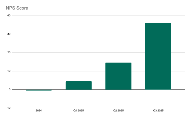
NPS held steady around 0 through 2024, but began to rise in 2025 as new members joined during Open Enrollment and we began to see a return on our investment.
But then, something exciting happened. As NPS results began coming in from new members in the new year, we started seeing some movement.
Healthcare benefits are very seasonal, with most new member acquisition coming during Open Enrollment in the fall, and members onboarding in Q1. We had underestimated the impact this seasonality and slow rate of change in perception would have on our key metrics. As 2025 has progressed, we started seeing the movement we’d been hoping for.
All major categories of user issues declined
The systematic monthly tagging of NPS responses allowed us to specifically track improvements within the particular pillars of our strategy. As you can see, all 3 pillars showed meaningful improvement throughout 2025 so far, with provider coverage / access still being the leading driver of dissatisfaction.
Taking a closer look using the tags we applied to our results, we were able to see a meaningful decline in detractors across all 3 major categories we’d identified at the beginning of the initiative.
The team had to wait a long time to see the impact of their work, but the wait was worth it! My team, and the business overall, were thrilled with the result.
We’re aiming to keep this momentum going in 2025 with a major app redesign aimed at further improving member satisfaction and engagement. Read more about it here.