

Mobile app design
Driving engagement and member satisfaction with a mobile app redesign
Background
I recommend reading my other post about my time at Garner first as it helps set some context. This post is about year two of the strategy I laid out in that post, and focuses in on our mobile app redesign.
Here’s a quick recap:
In April of 2022, I joined Garner Health as their Head of Design and first full time designer with the charge to build a high performing design team to create a usable, understandable, and trustworthy member experience.
I joined Garner at a really exciting time. The company was starting to get real traction in the market and growing rapidly, but member experience was a blind spot for the organization. I set up systems to measure it through an NPS survey and user research program, and the results showed it was a significant problem. Our NPS was 0 (on a scale from -100 to 100), and our client attrition due to product dissatisfaction and low engagement was too high.
Based on the data and feedback, we developed a strategy with 3 major pillars:
Increase transparency and speed of claims and reimbursements
Improve trust in our recommendations
Improve program understandability
Year 1 was mostly spent fixing foundational issues with our claims, payments, and other data systems. These investments were crucial for the user experience and I pushed hard for them, despite most not being ‘design’ problems. At the end of year 1 we saw minimal movement in our metrics, so refreshed our strategy with a specific focus on driving member engagement and client retention.
I was tasked with defining a UX vision for the app focused around engagement and recommending a 6 month product roadmap that would allow us to launch a redesign of the app in Q3 before open enrollment.
Approach
Creating shared context
Defining the vision
Building buy-in
Planning the year
Outcomes
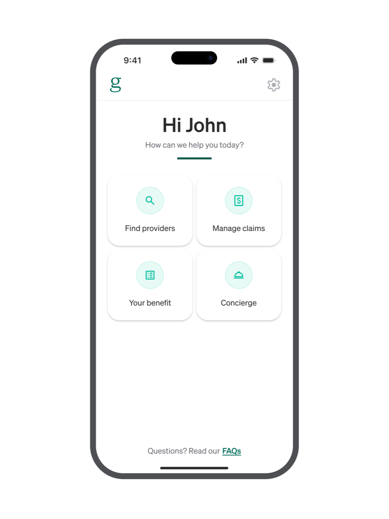
Our home screen looked amateur, wasted space, and created navigation problems.
Creating shared context
An existing foundation of research gave us a jump start
When we kicked this project off, we already had a lot of both qualitative and quantitative research and insights. Most key stakeholders and project partners already had strong perspectives. We needed now to synthesize those perspectives and bring them together into one coherent vision.
Here’s a summary of what we knew going in:
We knew we had an engagement and member satisfaction problem and it was affecting client retention.
We knew the biggest actionable blockers to both engagement and satisfaction for members were:
Not enough visibility and transparency with claims undermined trust and reliability
Poor program understandability made it difficult to get started
No in app mechanisms to surface contextual notifications to members limited our ability to engage members at key moments
We also knew we probably wanted to redesign the home screen. It looked amateur and undermined trust in our brand which created risk for engagement. It also wasted space — The entire front page of the app was taken up by the global navigation. Last, it created a cumbersome hub and spoke navigation system, making context switching within the app hard. We were open to changing our views as we dug in further, but based on what we knew, this seemed like a fairly obvious, high ROI improvement.

The high level steps in the journey we designed around. The journey gave us shared anchor points we knew we needed to consider and helped us speak the same language. Each of these steps were further broken down into more discrete segments that we used as the foundation for our ideation.
With that context in mind, I planned a series of workshops to get our core team aligned around a unified vision
I organized two workshops with key product, design, and engineering partners that stepped through our core user journey that allowed participants to get in sync, get their ideas out, and begin fusing them together into a coherent app experience. Over the course of two sessions, we stepped through:
Review of key insights and context
Alignment around key member personas and the core user journey we wanted to design around
Ideation across key touch points in the journey
Loose wireframing of key ideas into a journey
Here’s an example segment of a journey one participant put together during our wireframing. All participants made low fidelity journeys like this that formed the foundation of our concepts.

An example of some of the low fidelity mockups we generated in our original workshops to quickly get out key ideas. These mockups show a new bottom navigation, improved steerage with recommendations for not approved providers, and an early version of what ended up being the Care Team.
Then, I paired with a very strong visual designer on my team to go through several tight iteration cycles refining the user journey and wireframes into more polished mockups that told a coherent story and captured our key concepts. We did this in tight coordination of the original group with feedback cycles every few days until we felt aligned on the vision.
Here’s a sample of vision we came up with
Below are three slides from the deck we used to build executive buy in. Our actual vision was a longer, full journey, but this should give you a sense of what it was like. The vision was designed for voice over, with me narrating the journey our member, Allison, was experiencing, whilet the slides highlighted key concepts. This is the same part of the journey as the lower fidelity mockups from above, so you can see how it evolved.
Across our vision, we highlighted several key ideas that we proposed taking steps toward this year
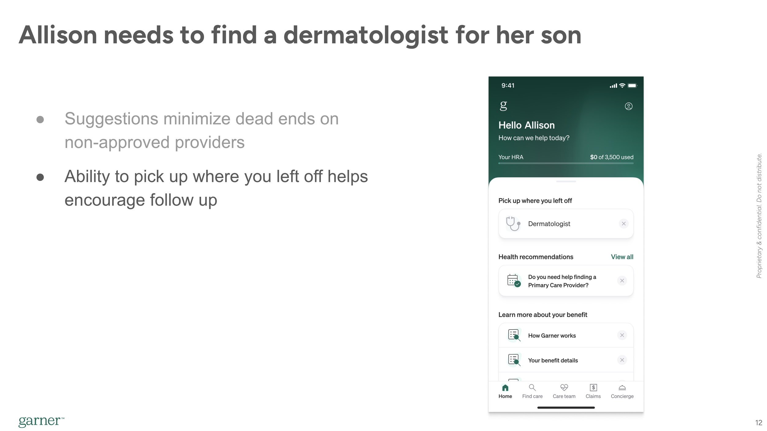
More personalization and proactive messaging, manifested through a new dynamic home screen
Improved program understandability through better onboarding, more personalized guidance, and a fix to a structural usability problem with the Care Team (Shown below).
Better visibility into claims and payments manifested through a new benefit tracker and expanded set of claims statuses to provide more transparency.
Better contextual support along the journey, manifested through in app scheduling that allowed us to understand when an appointment was scheduled (This part was a bit aspirational).
I worked with my PM partners to break the vision down into smaller pieces we could prioritize
We identified and prioritized following core pieces and built a more stripped down, MVP version of the vision that was stricter with elements we specifically planned to build that year as a part of one of these components.

An example slide of a pared down concept that honed in on the specific components we aimed to build this year.
Improved in-app onboarding
A new home screen that allowed us to surface personalized, contextually relevant information to drive engagement (Shown on the right)
A new bottom navigation system (Shown on the right)
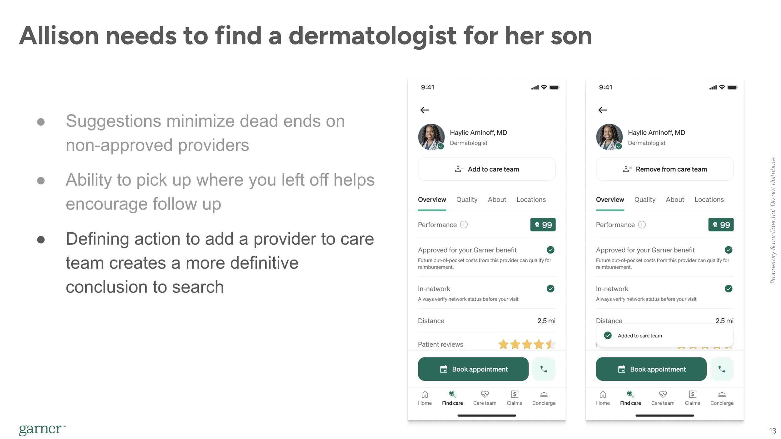
A new feature called Care Team, that allowed members to save providers and created more clarity on how to use the program.
Enabling members to see pending and denied claims
A benefit tracker showing the total and remaining benefit
An AI chatbot to help answer member questions faster
We circulated the more stripped down vision, as well as a drafted roadmap plan that would allow us to launch in August ahead of Open Enrollment, circulated the proposal with key stakeholders and leadership around the company, solicited input, and ultimately won buy in to move forward with the redesign a month ahead of schedule.
We won buy in from all key stakeholders and leadership
The projects above were handed off to various teams. My team at this point was understaffed, with two yet-to-be-filled headcount, so I took on Onboarding and the Benefit Tracker personally, while overseeing the other projects with the support of other designers.
I won’t walk through each project in details, but I’ll do a quick zoom in on Care Team to give a sense of more specific project work we did.
Deep dive on Care Team
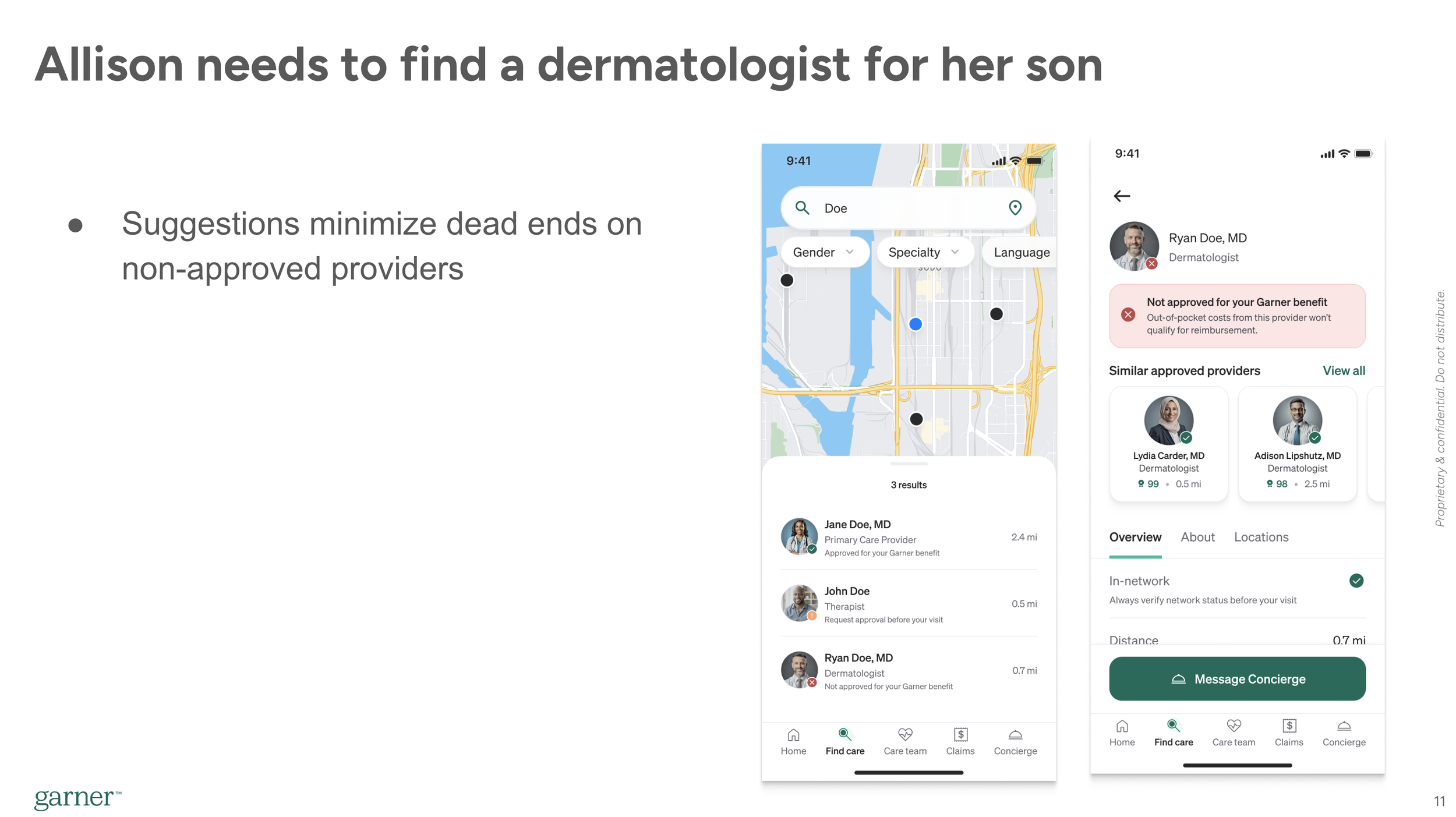
Garner’s program has an engagement requirement, meaning members must search a provider in the app before they can qualify for reimbursement. The way it works was that when a member searched in the Garner app, Garner automatically saved the providers that showed up in the search results to a list of Approved Providers.
At face value, this seems like a reasonable system. Its automated so members don’t have to think about it, so should minimize friction. Instead, we saw a few problems that surfaced time and time again in user interviews and member feedback.
Key problems
There was no visible confirmation when a provider was added. Members were uncertain if they’d filled the engagement requirement or not when they’d searched. Oftentimes, they just didn’t understand how it worked, and if they did, it was cumbersome to go sift through the full Approved Providers list to verify if the provider you wanted was added.
The approved providers list quickly filled with hundreds of irrelevant providers. We added all providers who showed up in search results to ensure we gave appropriate credit, but this meant that the select few a member actually saw were hard to find.
Maybe most importantly, there was no defining action we could educate around. We told members they had to search, but this often created confusion. Members wanted a more specific action to help them understand what they needed to do to use the program successfully.
“I’m not exactly clear on what I need to do to add him as a provider. I know I can search for him by name, but if I go into the app and I look at my list of Preferred Providers, its not just him, its everybody with that search term I used”
This was one of those problems that had been festering for quite a while, and a lot of thinking and ideation had been done around it for over a year leading up to this work. We quickly reached consensus this needed to be a key element of the redesign, but there were several key and controversial design decisions we needed to make about the feature.
Key design decision points:
Should we build a new feature that lets members add and save, or just modify the Approved providers list to be more navigable.
If we build a new add feature, should we require members to use it in order to get reimbursed, and if not, how do we educate members about it?
If we build a new feature, where in the information architecture should it live?
How can we balance the visual hierarchy of the provider profile with this new element?
Let’s deep dive on one of them.
Where should Care Team sit in our information architecture, and how should it relate to the Approved Providers list?
While everyone agreed we needed to build something like the Care Team, the specific shape of the feature had some meaningful sticking points. At the center of it was the question - where should it fit into our architecture, and what do we do with the existing Approved Providers list? Here were our decision criteria and options:
Decision criteria
Must allow members to easily find the providers they care about again
Must project a clear mental model for how to use Garner, and simplify the “1,2,3” explanation. (I.e. How would you explain how to use Garner in 3 steps?)
Should minimize disruption to existing members
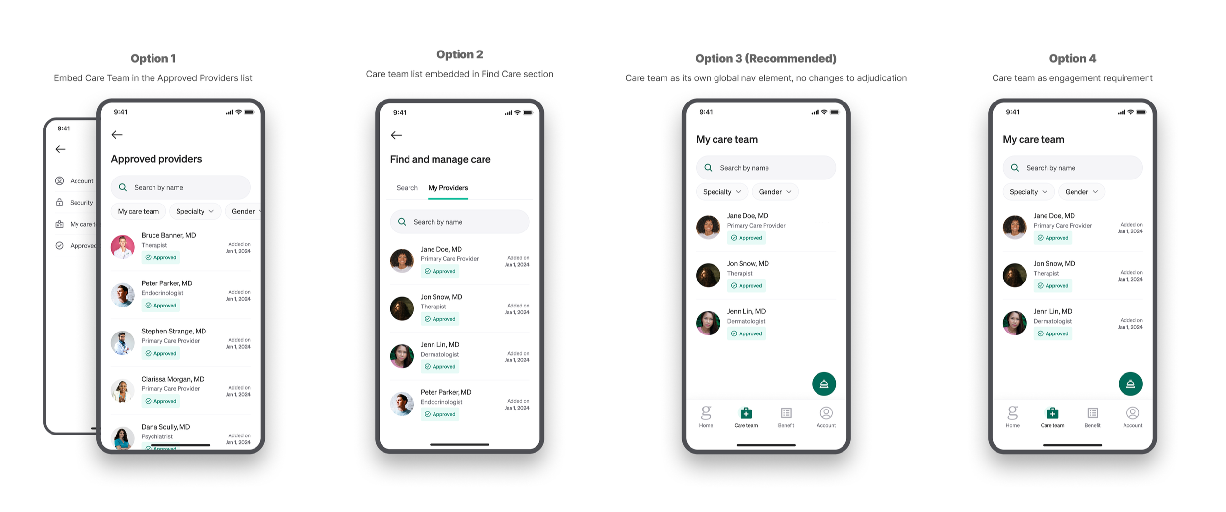
Some of the different options we considered as we thought through the architecture of the Care Team.
1. Wrap the Care Team into the Approved Providers list
This was a simple, incremental improvement, but de-emphasized the Care Team meaningfully, and still blurred it with a list of providers members didn’t care about.
2. Add the Care Team to search section
Our CEO was pushing this option to wrap the manage care functionality into an expanded search section of the app called Find and Manage Care. This conceptually made sense, but we didn’t feel it elevated the Care Team to the level of importance it deserved.

Our final design for the Care Team list. We decided its level of importance warranted making it a new global navigation element.
3. Add a new feature to add providers and educate members they should add their providers to ensure get reimbursed. Don’t actually change adjudication policies and keep the approved providers list, but deemphasize it and use it as a backstop to ensure members get credit for their searches.
This was the approach we selected. It allowed us to get the best of all worlds. Minimized disruption and change to our adjudication policies, and an improved 'How to use Garner in 3 steps’, and a simple list for members to find their providers.
The biggest risk in this approach was confusion between the two lists, particularly for existing members. We rigorously tested this in multiple rounds of user research, including evaluative user research in an early access launch later on, to derisk and validate it would work.
We also thoroughly circulated this within Garner, building buy-in all the way up to the executive leadership level as this requirement a meaningful shift in how we demo'ed the product. I partnered tightly with our marketing, sales, and account management teams on how we’d message it to new and existing users and how we’d demo it to clients.
4. Add a new feature that lets members add providers and use it for the engagement requirement, and deprecate the approved providers list.
A short video showing the animation and visual hierarchy we aligned on for the Add to Care Team button we added to the provider profile. It was important this action stood out as a key moment in the journey. The visual hierarchy of this design was challenging to balance with the ‘Approved’ banner and the other actions at the bottom of the page.
This was also a clean option that would have allowed us to fully migrate to a new system that solved the problems listed above. There would be a clear, defining action and a simple list of the providers members actually cared about. The problem was it created a huge usability risk for existing members, and created a stricter system that would likely result in misunderstandings and an increase in denials. If a member forgot to add their provider to the list, they wouldn’t be reimbursed. It also created some weird edge cases - for example, what if they removed them from the list?
Hopefully that gives you a sense of how I approach design decisions: Define the problem, establish decision criteria, ideate a range of options, then evaluate and stress test until we’re sufficiently confident its the best approach. Then continue measuring and testing through and past launch to understand impact and inform future iteration.
Rollout
Our teams designed and developed these features over the last 9 months. We bundled several of them together into a bigger splash launch, while rolling others out on their own timing depending on what made most sense.
The bigger splash launch, which included the home screen and navigation redesign, Care Team, and the benefit tracker, was rolled out in a dogfood then an early access program to de-risk the launch. I conducted evaluative user research with the early access cohort, including live interviews and surveys, while the product team monitored our engagement metrics.
We did a full general availability launch in late August, with the other unbundled features rolling out over the rest of the year.
Here’s some key screens of what the new product looks like:
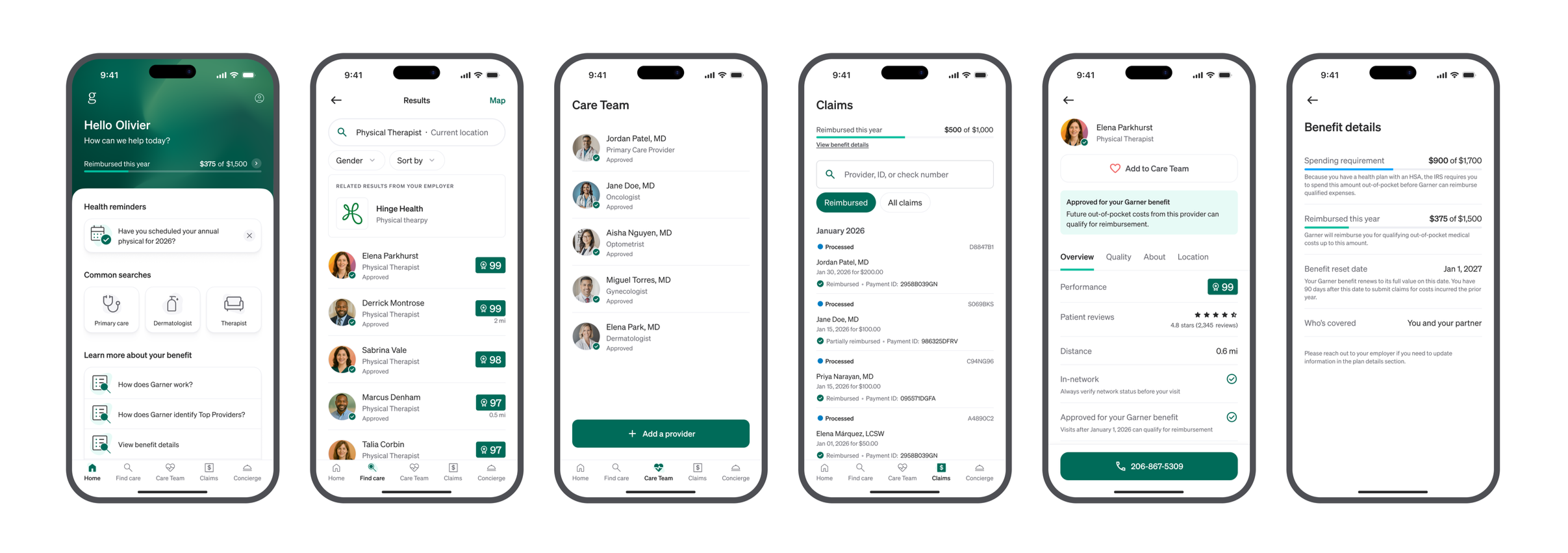
Some images of our final version of the redesign. Shown are the new home screen, global navigation, Care Team, benefit tracker, and improved claims list.
50% of existing members surveyed said the redesign was an improvement
As of writing this, we only have early leading indicators of the outcomes for this work.
In early access launch survey, we received positive feedback from existing members, who we expected a more tepid response from due to early aversion to change and only sporadic product usage. About 50% of members surveyed said the changes were Major Improvements or Improvements, with about 45% neutral and 5% saying they were worse than before. Given change aversion, this was a very positive response.
In interviews, members cited generally positive to neutral responses, saying it was “easier to maneuver through the site” and how helpful it was ‘Knowing how much benefit I have used”.

Claims and Usability detractors have declined significantly over the course of this year. We believe this is largely a lagging indicator from the changes we made in Q1.
We expect the major movement in our metrics to come in Q1-Q2 of next year as we onboard new members to the experience and benefit from fresh impressions.
Overall this year, NPS has already risen from 0 to 35 from the changes we made last year, and similarly we have already hit our engagement targets for the year. This is in large part due to the work cited in my other post about Garner, where we saw delayed movement in metrics until the new year.